Download Thrift Font Family From Up Up Creative
Download Kisba Font Family From Moritz Kleinsorge
Kisba is a brand new serif typeface that operates to arouse attention. As contrasts are known to attract each other, Kisba combines sharp, triangular serifs and spiky outgoing strokes with round and soft ball terminals. It’s a typeface driven by visual contrast.
Kisba’s extraordinary design of thin and monolinear diacritics, selected punctuation marks and symbols creates a modern and elegant atmosphere. With extravagant letters like the f, k and x, Kisba is primarily labeled as a typeface for display usage or shorter texts, that catches the reader’s eyes.
The typeface exists in seven weights from Thin to Black offering plenty of possibilities to set texts and headlines. With about 600 Characters per weight, Kisba contains Open Type Features like an extended set of ligatures and language support, case sensitive forms, different sets of figures and arrows.
As a perfect companion to Kisba, my geometric Sans Serif Flink owns the same cap height. That way, you can set uppercase letters next to each other very easily.
Download Pulpo Font Family From Floodfonts
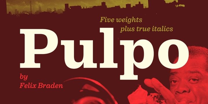
A friendly and comfortable looking typeface inspired by Century Schoolbook and Clarendon. Despite the strength and sturdiness of the design, each letter shape carries warmth and an echo of the human hand. The familiarity of the letterforms also conceals some nostalgia.
The family has 10 weights, ranging from Light to Black (including italics) and is ideally suited for editorial, advertising and packaging as well as web and app design. A massive body combined with low stroke contrast, emphasizing the horizontal elements, make it very suitable on screen and for small text sizes on newsprint paper.
Each style includes 489 glyphs with four sets of numerals and extended language support to meet the needs of today’s communication.
For more information visit the microsite.
Download Courage Font Family From Positype
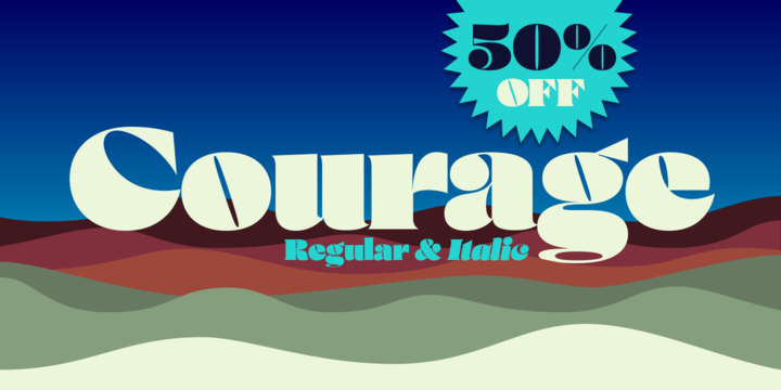
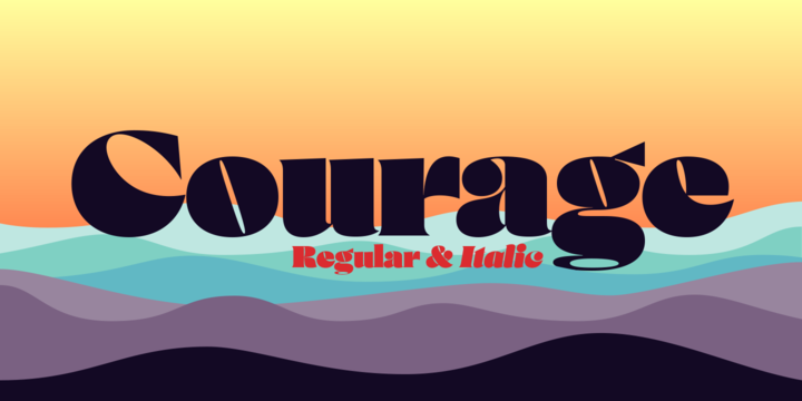
High-contrast? High impact? Have Courage? Eye-catching and (extra, extra) bold, Courage balances ultra-high stroke weight, delicate details, and unique letterforms with a self-indulgent passion that will make you feel a little guilty using it. Honestly, use it large and don’t try to force it into a small space, because these fearless letterforms need room to move. Flavored with both upright and italic styles, each font includes an indulgent level of alternates, swashes and titling options, visual elements and more.
A backstory with a different name
Years ago, I was commissioned to take my Lust typeface and produce something unique to use for large format graphics for an event…cool. It needed to be hyper-contrast with a lot of over-the-top details. With a tight turnaround, I looked for primers within my development catalogue to help me, and settled on some early work on a typeface I had drawn called Hedonist. I used those sketches and its conventions to retrofit and build out Lust Hedonist (only to see the project go bust on the client’s end). I intended to go back shortly after the Lust Hedonist release to finalize a retail version of the OG Hedonist, but I never could settle on the look of the ‘g’ or the numerals, got distracted with other projects, and never picked it back up… until last year. After randomly doodling a fat, flat ‘g’ with an extremely tilted counter axis, I knew immediately how it could be used and that (re)set things in motion. Only problem was, in the process of refining the letterforms I began truly dissecting the pieces, rediscovering all of the recklessness within Hedonist, and decided on fundamentally rewriting the approach to the typeface… literally flaying it to the bone. I’m much, much happier with this finished typeface now, but the name no longer fit the moniker given to the first, adolescent approach—there’s far more audacity and cleverness in these letterforms, tenacious in their resolution now. As a result, the name Courage fit the mettle of this typeface so much more, so I kept it.
Download Burger Font Family From Lián Types
Inspired in the world of the fast-food, my aim with Burger was to achieve a sexy slab serif font. Since it’s not very common to see slabs with swashes I consider this project as an experiment with interesting results.
In order to mantain an even weight on the written word, all the glyphs including the swashy ones had to look like compact blocks: This makes the font work much better used with almost no leading, as seen in posters above.
Despite the formal look of its genre, this slab serif is also very playful and unique. (Maybe unhealthy food deserves better fonts already, right?)
Taste Burger, come on, give it a try!
On a more personal note:
Why I made this font? Some months ago I started the gym and with it, an strict diet to see some results faster... Maybe my temptation is being, in Lacanian terms, “sublimated” by making delicious and unhealthy fonts.