


Hi! Introducing a vintage style font Shining Night. This font has additional font file with round dots over the base glyphs, that immitates a lamp lights of a real cabaret signboard.
Hi! Introducing a vintage style font Shining Night. This font has additional font file with round dots over the base glyphs, that immitates a lamp lights of a real cabaret signboard.


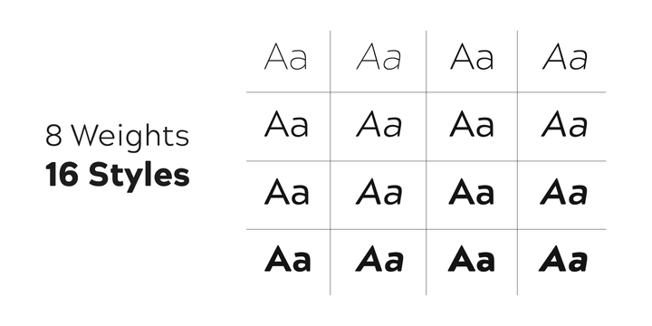
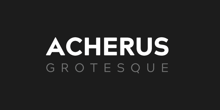
Acherus Grotesque is a rounded sans serif type family based on geometric forms. It comes in 16 styles, 8 uprights and matching italics.
Each weight includes extended language support, ligatures and more. Acherus Grotesque is incredibly useful for nearly any creative design.

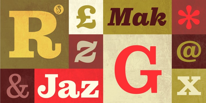
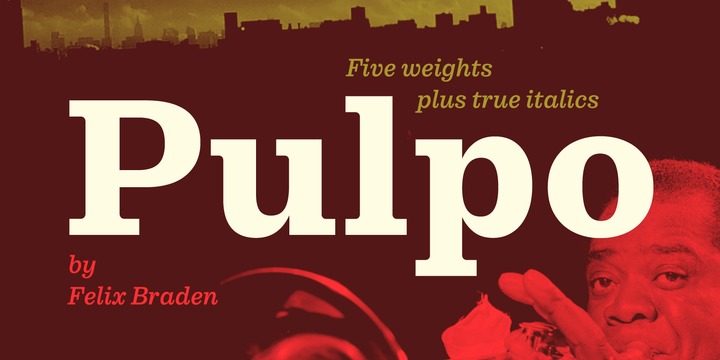
A friendly and comfortable looking typeface inspired by Century Schoolbook and Clarendon. Despite the strength and sturdiness of the design, each letter shape carries warmth and an echo of the human hand. The familiarity of the letterforms also conceals some nostalgia.
The family has 10 weights, ranging from Light to Black (including italics) and is ideally suited for editorial, advertising and packaging as well as web and app design. A massive body combined with low stroke contrast, emphasizing the horizontal elements, make it very suitable on screen and for small text sizes on newsprint paper.
Each style includes 489 glyphs with four sets of numerals and extended language support to meet the needs of today’s communication.
For more information visit the microsite.
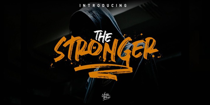
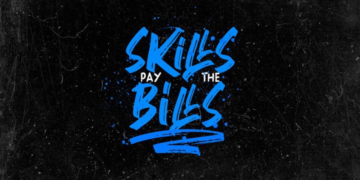
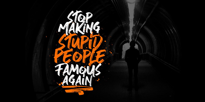
Stronger is a supercharged, street-wise brush font bursting with energy. With extra attention to quick strokes and sharp details, Stronger is ideal for logos, apparel, quotes, product packaging, or anything which needs a typographic turbo-boost.
What’s Included:
Stronger Regular - The standard version of the font. Perfect for titles and logos.
Stronger Swash - Need a cool underline under your text or a splash of paint? This font set has you covered. Type any letter a-z using this font, and you'll get a unique swash to accompany the font